Sunday, 25 July 2010

First part completed moving on to Assignment 1

Well at long last i have waded through all the exercises leading to the first assignment.
The study materials arrived on 11th May and its taken a while to get this far , a little longer than expected due to various outside influences including a job change .


My honest opinion so far is that i have enjoyed some exercises and i thought some were rather dull and tedious, but hey ho all in the bag now so moving on......


I have been thinking about how i am going to tackle the assignment over the last couple of days , and will hold back a little until i receive guidance and advice from my tutor


Thursday, 22 July 2010

Exercise 12 : Cropping and Extending

This is the last exercise before assignment one , the aim is look at some images we have previously taken and crop them to enhance the image or use the cropping facility to find additional images within the original image.

Using Photoshop CS4 to carry out my cropping i will include the original image , the original image highlighting the area of crop and the the final cropped image.


cropping and extending (3 of 9) cropping and extending (1 of 9)

cropping and extending (2 of 9)

In the above images as i liked the initial image i have aimed to keep the same scene by using a tighter crop removing some of the un interesting dark sky and also an area of rocks to the left of the image giving a cleaner overall image

cropping and extending (6 of 9)cropping and extending (4 of 9)

cropping and extending (5 of 9)

Using a square crop on the above images again alows me to remove some unwanted elements , alowing me to produce a better composed image from the original

cropping and extending (9 of 9) cropping and extending (7 of 9)

cropping and extending (8 of 9)

In the above images the original contained a large area of un interesting sky and a non discript overhanging tree. The image was cropped to remove these elements adding focus on the church.

Thursday, 15 July 2010

Exercise 11 : Vertical and horizontal frames

The aim of this exercise is to take 20 images fitting the subject in the frame in the vertical format and then retake the same subjects in the horizontal format.Reading between the lines the course assumes that you normally use the camera horizontally and the outcome should be to think horizontal or vertical for each image you take in the future

I decide to take all the images whist out on a

horizontal and vertical frames (3 of 34) horizontal and vertical frames (4 of 34)

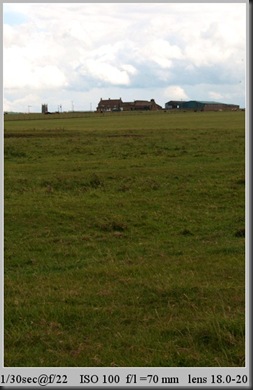
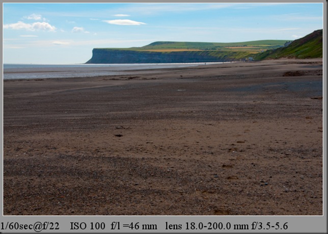
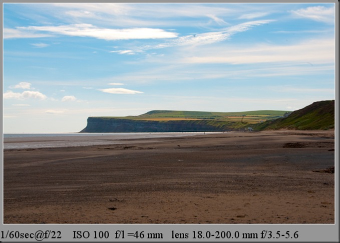
The first image gives a standard landscape format image ,whilst the second image is similar but gives a feeling of depth to the shot

horizontal and vertical frames (5 of 34) horizontal and vertical frames (6 of 34)

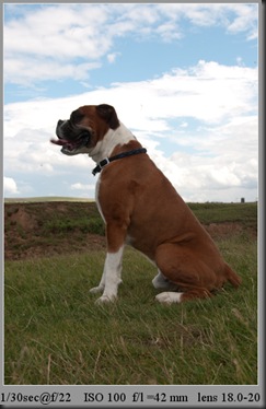
I went for a portrait theme with these images ,the second image works better than the first in my opinion it gives the dog an air of grandness about him where as the first image gives a squashed feel to the animal.
horizontal and vertical frames (8 of 34)horizontal and vertical frames (7 of 34)

Both formats work for me in these two images , the horizontal gives a feeling of space whist the second adds depth.

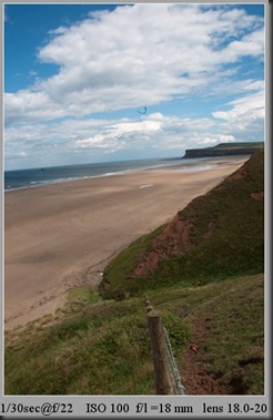
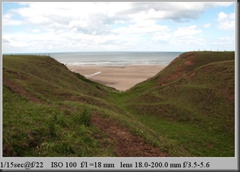
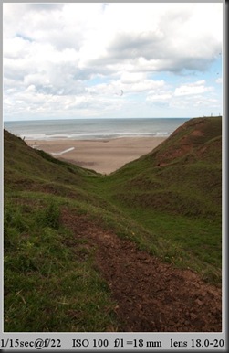
horizontal and vertical frames (9 of 34) horizontal and vertical frames (10 of 34)

A standard beach scene both images have their own plusses and minuses , the first image shows off the whole scene where as the verical gives prominence to the sky adding a different aspect to the scene.

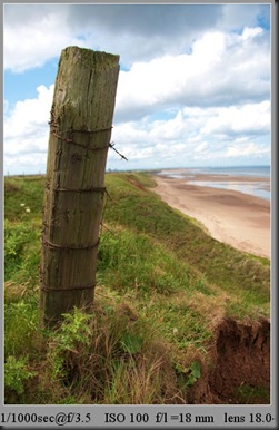
horizontal and vertical frames (12 of 34) horizontal and vertical frames (11 of 34)

For me the horizontal does not work , but on the other hand the vertical does with the wooden post leading you into the back ground.

horizontal and vertical frames (13 of 34) horizontal and vertical frames (14 of 34)

Once again two images that work the second gives the sky an airing but the horizontal works best for me with the fence leading you in to the depth of the image.

horizontal and vertical frames (16 of 34) horizontal and vertical frames (15 of 34)

Although neither images really do it for me they demonstrate the exercise ,image one fitted the frame easily ,but i had to get in close to get a decent framing ,

horizontal and vertical frames (17 of 34) horizontal and vertical frames (18 of 34)

A different slant on the same theme as the previous two images, both work the first image gives a touristy slant to the image showing the footpaath sign and also including the footpath in the image. The second image concentrates mainly on the sign

horizontal and vertical frames (19 of 34) horizontal and vertical frames (20 of 34)

Returning to the animal theme both images work equally in my opinion
horizontal and vertical frames (22 of 34)horizontal and vertical frames (21 of 34)

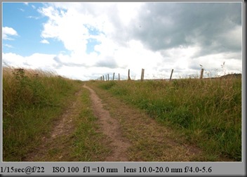
Although both images work in their own way ,however i feel that the vertical is the better image with the path leading your eyes in to the sky

horizontal and vertical frames (23 of 34) horizontal and vertical frames (24 of 34)

Although not really very artistic i feel the second image is the more interesting image in the way that it focuses on the post and litter rather than the overall view in the first image.

horizontal and vertical frames (25 of 34) horizontal and vertical frames (26 of 34)

horizontal and vertical frames (27 of 34) horizontal and vertical frames (28 of 34)

Once again the vertical version works for me by using the foreground to lead you to the derelict shed.

horizontal and vertical frames (30 of 34) horizontal and vertical frames (29 of 34)

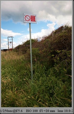
The vertical works again in these images isolating the sign and showing the hazard it relates to in the distance rather than including various other elements as in the horizontal image.
horizontal and vertical frames (1 of 1)horizontal and vertical frames (31 of 34)

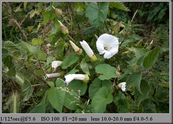
On to a bit of nature both very similar in their presentation and neither format either adds or subtracts to from the subject

Conclusion: Most scenes can be made to work with both a horizontal and a vertical frame although each orientation can enhance or detract from an image. The vertical frame often adds depth and can be used to isolate an element within the image , on the other hand the horizontal frame can add width and can be used to include extra subject matter within the frame.

Sunday, 11 July 2010

Exercise 10 : Position the Horizon

The aim of the exercise was experiment with how the position of the horizon can influence the overall feeling of an image.

I took a sequence of six images from the same viewpoint, moving the frame so that the horizon was placed in a variety of points ranging from the bottom to the top of the frame.

horizon (1 of 6)

In this image the horizon is situated at the top of the image giving the foreground prominence in my opinion it does not work as the subject matter in the foreground is too plain and un-interesting.

horizon (2 of 6)

In this image the horizon is situated at the high in the image , as with the previous image the subject matter in the foreground is too plain and un-interesting.

horizon (3 of 6)

In this image the horizon is situated in the center of the image splitting the image in two and giving a static feel to the image

horizon (4 of 6)

In this image the horizon is below center of the image giving it a standard landscape view

horizon (5 of 6)

In this image the horizon is situated towards the bottom of the image starting to give the sky prominence

horizon (6 of 6)

In this image the horizon is situated at the bottom of the image giving the sky prominence in my opinion this is the best position for this particular view as the sky is quite dramatic.

Moving the position of the horizon can give an image varied results and is very much dependent on what you are trying to achieve in the photograph. Placing the horizon high or low within the frame purposely gives additional focus to either the earth or sky, so if your intention is to make the viewer pay attention to these areas then this is a good technique to use. Positioning the horizon dead centre gives a balance image but in my opinion is too symetrical. The eyes can be steered to the detail and interesting areas of the image by composing the image with the horizon placed in a strategic position

Thursday, 1 July 2010

Exercise 9 : Balance

The object of this exercise was to comment on 6 photographs which i had previously taken. I was to critique each image with regard to the balance of the image

The major balance elements of each image have been circled in pink and my explanation of this is shown using the weighing scale below each image showing areas of balance within each photograph.

As this is an area i have never considered when taking photographs I chose six images purely at random to highlight to me whether or not i had previously managed to get images ‘ in balance’

balance (2 off 6)

Two large area in this image , which sort of balance themselves out

balance 3

Three areas in this image two large and one smaller, slightly unbalanced in my opinion

balance 4

Two large areas that balance nothing else really to add , quite pleased although i was unaware at the time of exposure

balance 5

Another image which i feel balances out quite well , one large ad three smaller areas.

balance 6

Surprisingly another balanced image , although if i were being hyper critical a smaller area of sky would have produced a better image

balance (1 of 6)

The worst balanced of all the images , doesn't really cut it for me.

Conclusion

A very worthwhile exercise for me , will really appreciate the element of balance in future images.

Although quite a few of the chosen images were balance it was more good luck than planned , unless my subconscious mind was helping me !!