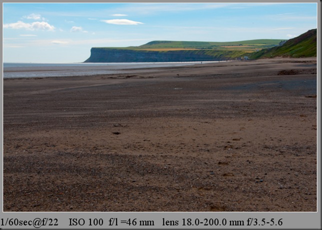
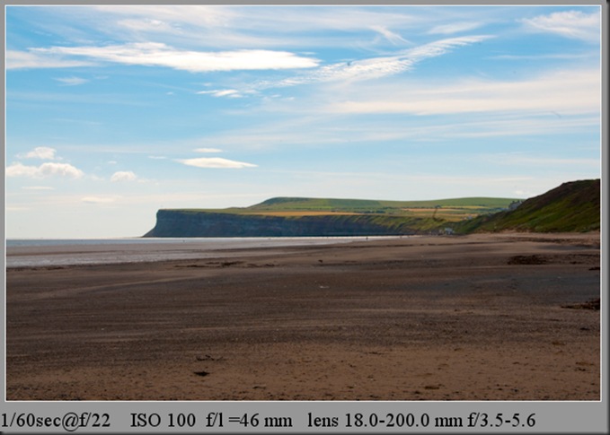
The aim of the exercise was experiment with how the position of the horizon can influence the overall feeling of an image.
I took a sequence of six images from the same viewpoint, moving the frame so that the horizon was placed in a variety of points ranging from the bottom to the top of the frame.
In this image the horizon is situated at the top of the image giving the foreground prominence in my opinion it does not work as the subject matter in the foreground is too plain and un-interesting.
In this image the horizon is situated at the high in the image , as with the previous image the subject matter in the foreground is too plain and un-interesting.
In this image the horizon is situated in the center of the image splitting the image in two and giving a static feel to the image
In this image the horizon is below center of the image giving it a standard landscape view
In this image the horizon is situated towards the bottom of the image starting to give the sky prominence
In this image the horizon is situated at the bottom of the image giving the sky prominence in my opinion this is the best position for this particular view as the sky is quite dramatic.
Moving the position of the horizon can give an image varied results and is very much dependent on what you are trying to achieve in the photograph. Placing the horizon high or low within the frame purposely gives additional focus to either the earth or sky, so if your intention is to make the viewer pay attention to these areas then this is a good technique to use. Positioning the horizon dead centre gives a balance image but in my opinion is too symetrical. The eyes can be steered to the detail and interesting areas of the image by composing the image with the horizon placed in a strategic position


No comments:
Post a Comment